Kelsey Diane Designs
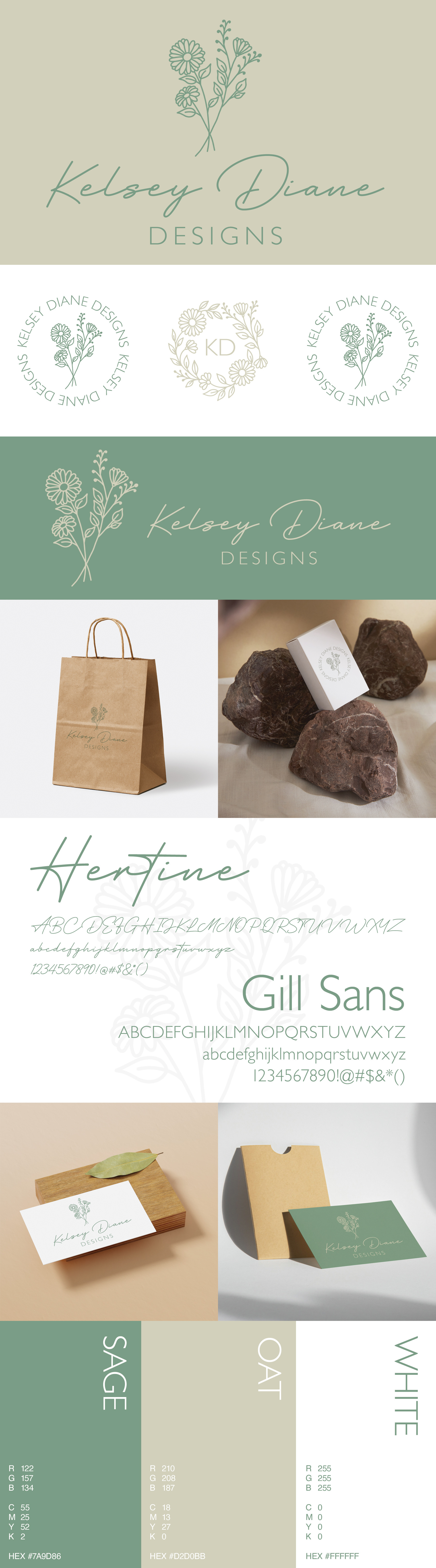
EightOne Creative partnered with Kelsey Diane Designs to develop a modern, organic brand identity rooted in elegance and nature-inspired artistry. A muted earthy palette, centered on sage green and warm taupe, creates a calm and timeless foundation.
The primary logo features a hand-drawn floral illustration paired with refined typography to balance softness and structure. A suite of alternate marks, including circular badges and a floral monogram, provides versatile options for social media, packaging, and stationery, resulting in a cohesive identity with modern minimalism and organic charm.
Kelsey Diane Designs is a boutique jewelry and home decor design studio based out of Chicago, Illinois. Kelsey's designs are rooted in nature and can be purchased at various shops, boutiques and farmer's markets around the city. She will be launching her online business in 2026.