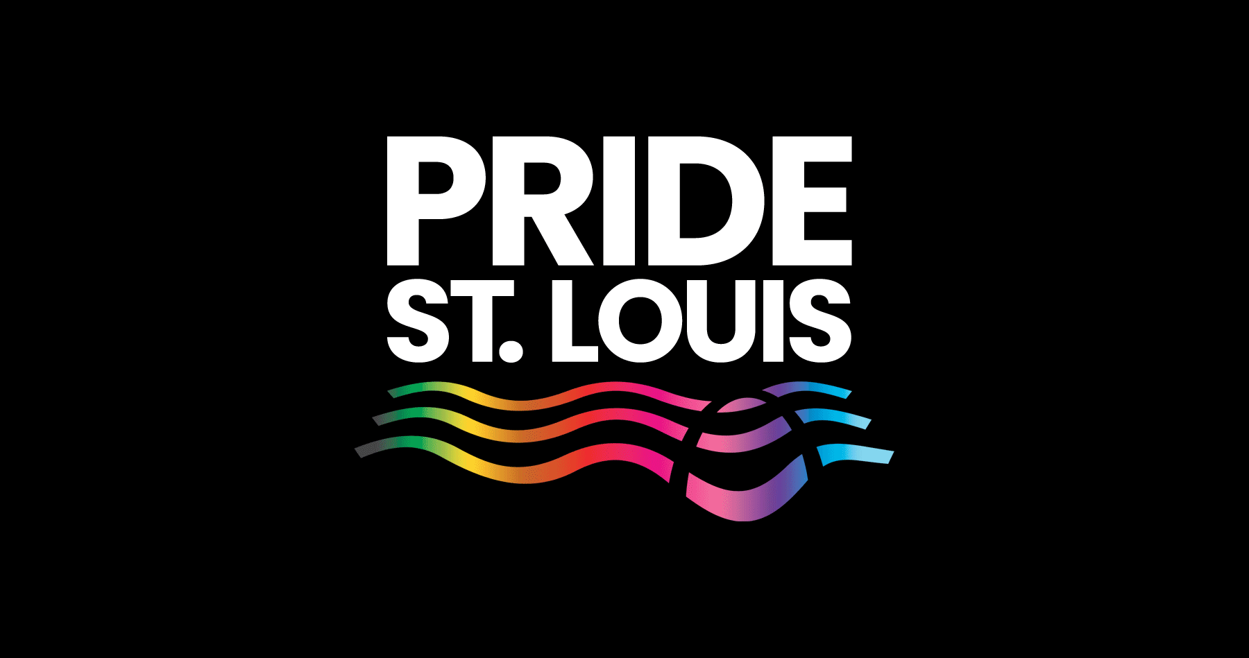
Pride St. Louis
EightOne Creative partnered with Pride St. Louis to create a new visual identity for the organization. The goal was to create something that truly represents the spirit and importance of both the organization and the city it calls home.
St. Louis has such an iconic skyline and cultural identity, so I felt it was important to ground the design in a sense of place that ties directly to the city’s geography and symbolism. The bold typography gives the logo a confident, but welcoming modern presence and by no longer abbreviating ’St. Louis’ to ‘STL’, as in the previous logo, it gives more prominence to the city the organization calls home.
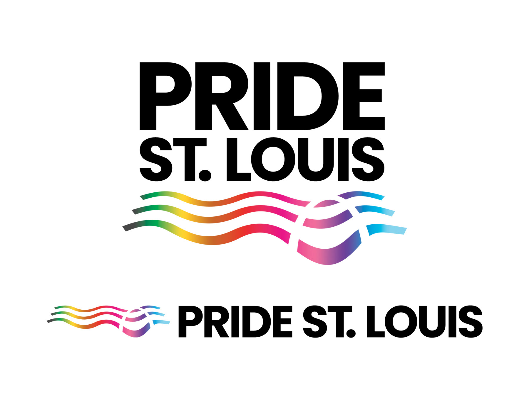
The flowing lines represent both the Mississippi River and a waving flag, capturing movement, unity, and pride in motion. Within those lines, a subtle cutout forms the shape of the Gateway Arch, creating a visual bridge between the St. Louis skyline and the Pride movement. This intentional negative space gives the design a strong connection to the city while symbolizing openness and inclusivity — a gateway that welcomes everyone.
The gradient spectrum across the lines represents the diversity and vibrancy of the modern Pride movement, connecting every color and identity into one harmonious flow. It’s a visual reminder that Pride in St. Louis is both rooted in place and moving forward together.
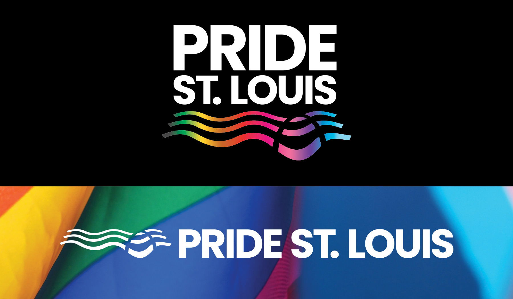
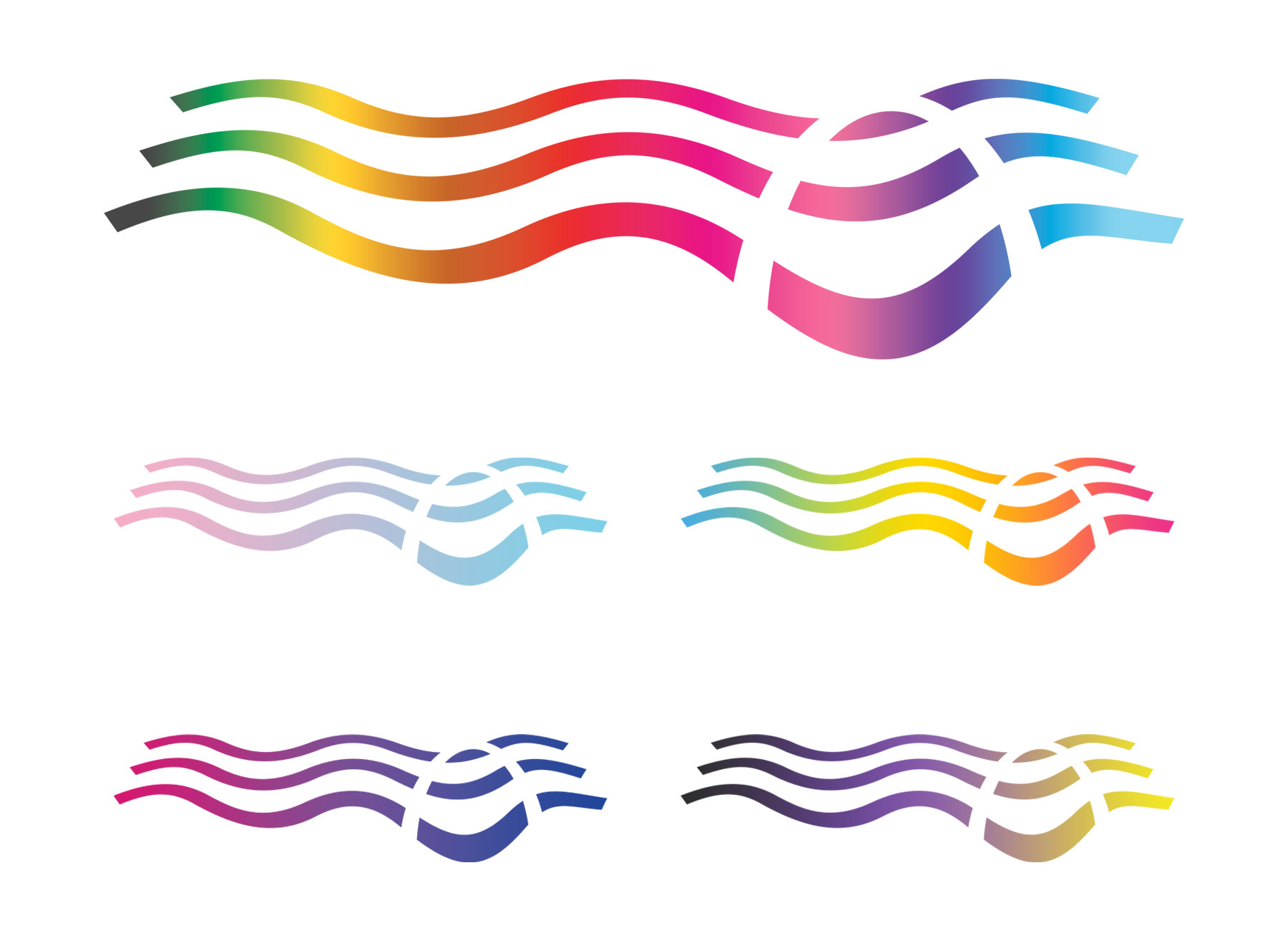
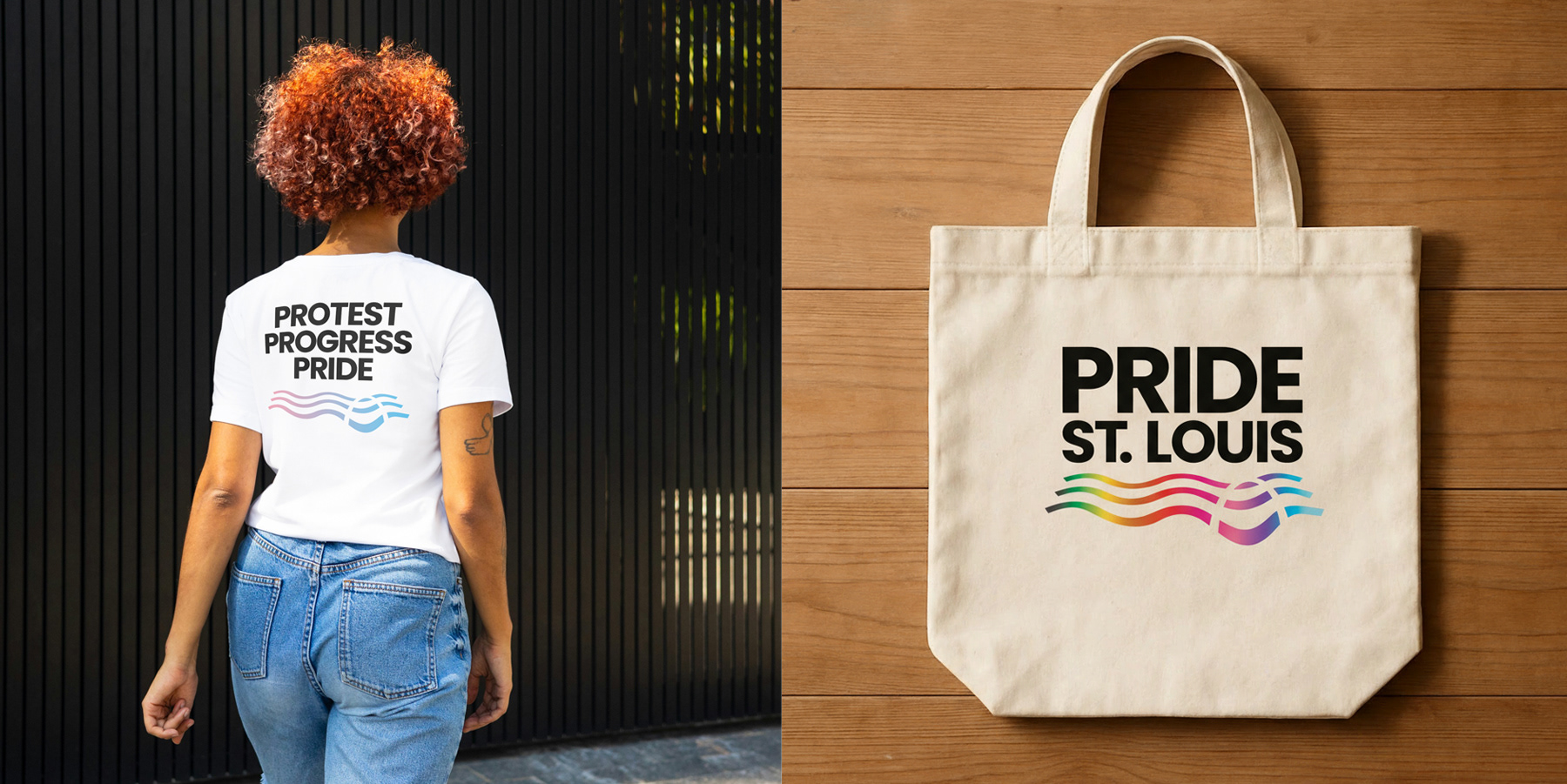
The design features an adaptive gradient, designed to evolve across uses and narratives. This flexible color system allows the logomark to reflect different stories within the LGBTQIA+ community, emphasizing inclusivity and representation. For example, the gradient can shift to pink and blue to honor the transgender community, or adapt to other color combinations that highlight specific identities and causes.
This adaptability ensures the logo remains both consistent and expressive as the Pride movement, and the colors that represent it, continue to grow.
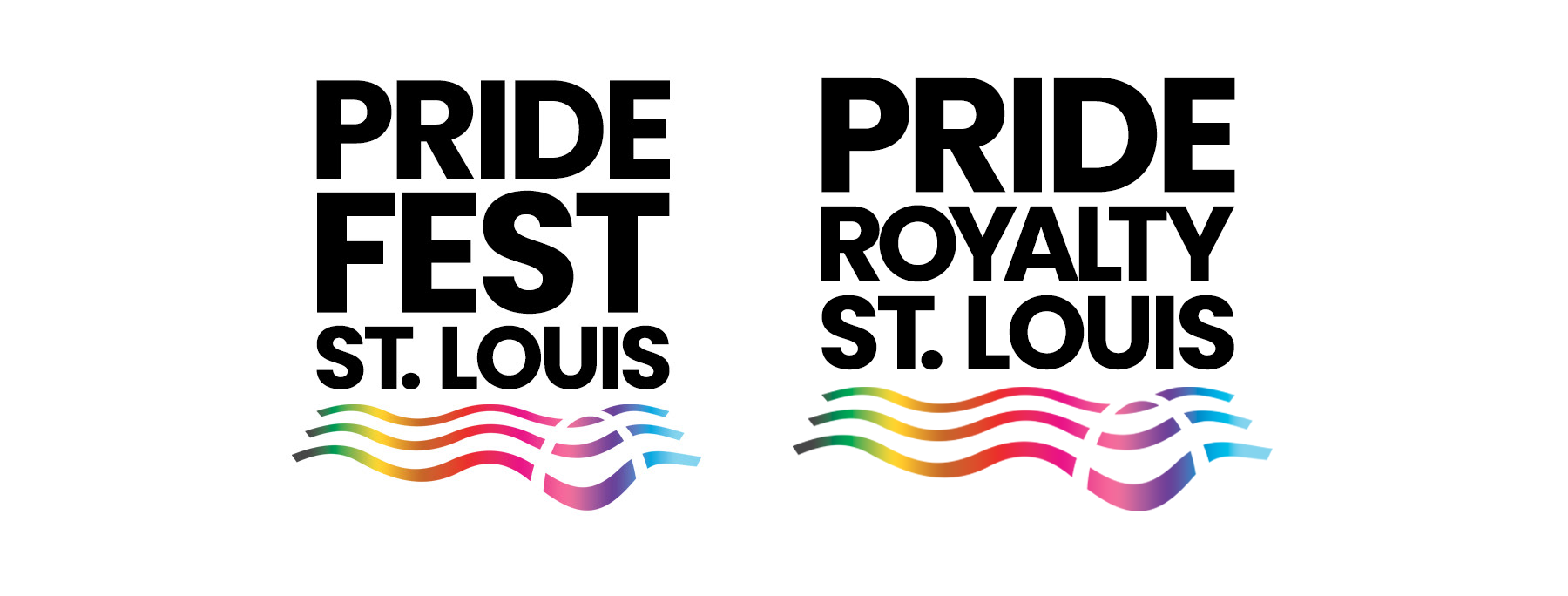
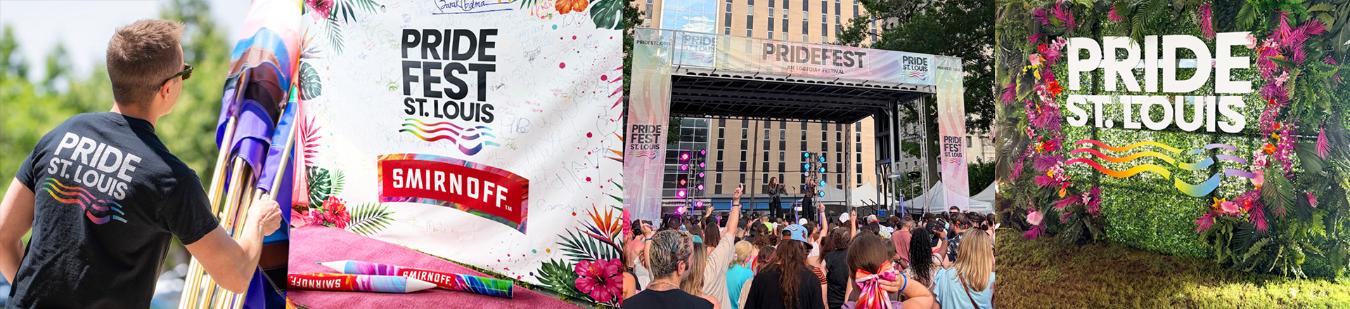
Additionally, the logo was designed to expand and adapt for various Pride St. Louis events and initiatives, such as Pride Fest and Pride Royalty, allowing each event to maintain a consistent visual identity under the larger Pride St. Louis brand.
This flexible system builds brand equity and recognition while ensuring every event contributes to the organization’s unified presence and lasting impact within the community.
The fight for equality is never-ending, and I hope this new visual identity catapults the organization forward into a new era of advocacy and activism. I’m proud to play even a small role in that effort. Learn more about Pride St. Louis.